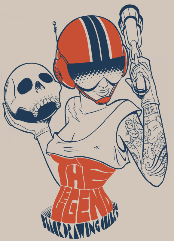
Succumbing to some significant physical and mental stress this week. As a result my allergies have kicked into high gear and I may even be coming down with a cold. Sooo I feel kinda miserable*.
Hopefully you found some humor in the image like I did, but the implied word basically says it all. Proper post coming tomorrow.
*Some sinigang sounds really damn good right now.
Showing posts with label art. Show all posts
16 September 2010
12 August 2010
Get Thee To Bed.
Uncharacteristically, this week's afternoons have crawled by, resulting in a couple of head-nodding moments at work. You could guess that it might be caused by post-lunch food coma. 95% of the time though, my lunch is a medium-sized salad consisting of spinach, carrots, almonds, egg and tomato drizzled with Catalina dressing. Not what you'd consider a heavy meal. So no, the culprit is lack of sleep. Surprise surprise.
The problem is not that I have trouble going to sleep. I don't; I typically head off to Dreamland less than five minutes after my head hits the pillow. However, I have trouble going to bed. For some reason I procrastinate crawling under the sheets for as long as possible. Those who know me well can probably guess (correctly) that I'm messing around online, reading, listening to music or most likely a combination of the three. (I don't watch TV and am temporarily living in a cell phone dead zone, so I suppose I have to fill my free time somehow.)
Sooo, yes, I'd rather be sleeping most of the time. Problem is, listening to the next song or reading the next article takes immediate priority ... and so does the next, and the next. Before I know it, it's past midnight and I end up drowsy the following afternoon.
This is not a viable long-term solution (although what am I really saying; I've been freakin doing this for years). I keep meaning to go to bed earlier, but it never seems to happen consistently. Hmmm. Maybe I should bring some kind of boring book to bed. Either that or up my dose of melatonin. At the very least, I know it's not my diet that's making my afternoons last an eternity ...
The problem is not that I have trouble going to sleep. I don't; I typically head off to Dreamland less than five minutes after my head hits the pillow. However, I have trouble going to bed. For some reason I procrastinate crawling under the sheets for as long as possible. Those who know me well can probably guess (correctly) that I'm messing around online, reading, listening to music or most likely a combination of the three. (I don't watch TV and am temporarily living in a cell phone dead zone, so I suppose I have to fill my free time somehow.)
Sooo, yes, I'd rather be sleeping most of the time. Problem is, listening to the next song or reading the next article takes immediate priority ... and so does the next, and the next. Before I know it, it's past midnight and I end up drowsy the following afternoon.
This is not a viable long-term solution (although what am I really saying; I've been freakin doing this for years). I keep meaning to go to bed earlier, but it never seems to happen consistently. Hmmm. Maybe I should bring some kind of boring book to bed. Either that or up my dose of melatonin. At the very least, I know it's not my diet that's making my afternoons last an eternity ...
published at
04:09
1 comment(s)
filed under
art,
melatonin,
patrick savile,
self-discipline,
sleep
07 July 2010
Back To The Future.
Artist Alex Varanese has apparently figured out the formula for combining modern technology with retro advertising design aesthetics. The result is ART/1977: We Are Not Time Travelers, a series of concept posters that are, in my humble opinion, seriously beyond cool. Varanese "re-imagin[ed] four common products from 2010 as if they were designed in 1977: an mp3 player, a laptop, a mobile phone and a handheld video game system. I then created a series of fictitious but stylistically accurate print ads to market them."
Ridiculously awesome. I even love the 70s color scheme (in the ads, anyway).
Looking at these makes me want to put Tron back on the Netflix queue and look for used Atari 2600 games on eBay. I know I just talked about not buying non-essential things in a recent post, but if these things actually existed, I'd be hard-pressed not to want them in my greedy little hands.
Ridiculously awesome. I even love the 70s color scheme (in the ads, anyway).
Looking at these makes me want to put Tron back on the Netflix queue and look for used Atari 2600 games on eBay. I know I just talked about not buying non-essential things in a recent post, but if these things actually existed, I'd be hard-pressed not to want them in my greedy little hands.
published at
04:45
0
comment(s)
filed under
alex varanese,
art,
atari 2600,
awesome,
cool,
design,
electronics,
retro,
tron
29 June 2010
ASCII Cam.
Here's an app I found that instantly turns your webcam image into ASCII art ... Being a complete geek, I had to give it a go. (Best viewed full-size.)
Kinda cool.
Happy Tuesday -- here's hoping you waste a few minutes out of your workday turning yourself into your own version of the Matrix screen.
Hrmmm, the second "self-portrait" post in a week ... maybe I'm becoming narcissistic. Either that or I'm running out of things to post about. Never that -- more substantial material tomorrow. Pinky swear. Oh yeah, look -- no more glasses!
Kinda cool.
Happy Tuesday -- here's hoping you waste a few minutes out of your workday turning yourself into your own version of the Matrix screen.
Hrmmm, the second "self-portrait" post in a week ... maybe I'm becoming narcissistic. Either that or I'm running out of things to post about. Never that -- more substantial material tomorrow. Pinky swear. Oh yeah, look -- no more glasses!
published at
04:20
0
comment(s)
filed under
art,
ascii,
cool,
geek,
self-portrait
16 June 2010
Everything Was Beautiful, And Nothing Hurt.
I wonder what the story behind these tattoos is. A quote from Kurt Vonnegut, Jr., it's an interesting phrase in and of itself and I'm curious to know what event inspired these sisters to get it inked onto their forearms.
I like how these look.
I've been thinking of getting a tattoo for several years now, and ideas have come and gone with none of them really feeling exactly right. These have included symbols and phrases, including some kind of stylized Baybayin script (which I initially thought might be cool but really isn't that original of an idea anymore*). Obviously I have to make sure that what I'm going to get is what I really really really want, so the search continues for a design that is personally significant (and attractive) enough to last me the rest of my life.
Perhaps I just need to dig a little deeper to find the inspiration.
*If I find the right style of Baybayin though, this option might still be a go.
I like how these look.
I've been thinking of getting a tattoo for several years now, and ideas have come and gone with none of them really feeling exactly right. These have included symbols and phrases, including some kind of stylized Baybayin script (which I initially thought might be cool but really isn't that original of an idea anymore*). Obviously I have to make sure that what I'm going to get is what I really really really want, so the search continues for a design that is personally significant (and attractive) enough to last me the rest of my life.
Perhaps I just need to dig a little deeper to find the inspiration.
*If I find the right style of Baybayin though, this option might still be a go.
published at
05:50
0
comment(s)
filed under
art,
baybayin,
cool,
kurt vonnegut jr,
tattoo
09 June 2010
The Front Cover.
With the upcoming release of J-Pros' second album, Pacific Central, we've been finishing up some important details having to do with mixing, sequencing and mastering the music. Reggie and I have recruited a couple of friends to help design the cover/album artwork to accurately represent the mood of our new batch of songs. Here's the cover we're going with:
I really dig this. Designed by the always-creative Arnold Arandia, it's a clean, clever and quite literal representation of the album title -- which combines our cities of residence (Seattle and Kansas City) in their respective timezones during our work on the music. (Needless to say, recording songs wasn't the easiest thing to schedule, but we got it done.)
We're also working on an actual website for J-Pros, so stay tuned for that. Meanwhile, I hope the sneak peek at the cover whets your appetite! It won't be long now.
I really dig this. Designed by the always-creative Arnold Arandia, it's a clean, clever and quite literal representation of the album title -- which combines our cities of residence (Seattle and Kansas City) in their respective timezones during our work on the music. (Needless to say, recording songs wasn't the easiest thing to schedule, but we got it done.)
We're also working on an actual website for J-Pros, so stay tuned for that. Meanwhile, I hope the sneak peek at the cover whets your appetite! It won't be long now.
published at
05:49
0
comment(s)
27 April 2010
Watch The Closing Doors.
No idea what's causing it, but I've been in a noir-ish kind of mood lately. Not depressed/sad/emo in particular really, but dark in a quiet, contemplative way. It's because a major chapter is closing in a few weeks; graduation and the national board exams are approaching fast, so anticipation of finally being done with school is building up. But I know I have to stay focused on finishing classes strongly and then pass the boards.
Anyway I dipped into Photoshop last night and came up with this. It reflects part of my current mood pretty well.
"Watch the closing doors" personally means that I need to be as self-aware of my current path in life as I can. This is actually quite important to me on a deeper level -- I've written about feeling lost before and while it was an interesting learning experience, I don't really want to feel that way anymore. Now, with a new chapter about to write itself, I want to make sure my steps are steady and I actually know where the hell I'm going ...
Anyway I dipped into Photoshop last night and came up with this. It reflects part of my current mood pretty well.
"Watch the closing doors" personally means that I need to be as self-aware of my current path in life as I can. This is actually quite important to me on a deeper level -- I've written about feeling lost before and while it was an interesting learning experience, I don't really want to feel that way anymore. Now, with a new chapter about to write itself, I want to make sure my steps are steady and I actually know where the hell I'm going ...
published at
05:09
0
comment(s)
26 April 2010
Messages In Stencil.
So I was looking for some fresh new wallpaper for the laptop. Every few days I like to rotate them to keep things interesting, cycling from abstract minimalist displays to tranquil natural landscapes, from stylized vector art to heavily photo-manipulated images. I've been in a kind of urban, gritty mood lately so my last couple of wallpapers have been city scenes with lots of concrete, steel, glass, artificial lighting and sharp, well-defined angles. Images of graffiti have always served as interesting wallpapers, so my current one is a photo of a popular Banksy piece:
Banksy is a popular graffiti artist hailing from the UK. Even if you don't know him by name, chances are if you've been around on the Internet you've seen some of his stuff. As with thousands of fans, his style resonates with me.
I like the "look" of his art; much of it is clean, high-contrast stencil work. His use of shadow and negative space is imaginative and creative, and he often uses elements of the surrounding area to enhance the piece. Banksy is not the most colorful graffiti artist, but the colors that he does use are used to maximum effect.
More often than not, there is some sort of sociopolitical message attached with his work which are usually usually anti-war, anti-capitalist or anti-establishment. Sometimes they're just funny. But I like the fact that he's actually trying to say something instead of just tagging his name up on a random wall.
Exit Through The Giftshop, a documentary about street artists including Banksy, recently premiered at Sundance this year to mostly positive reviews. The trailer looks promising, so I will have to watch this one late night -- with a couple of beers and some Phantogram tracks -- to complement my mood.
Banksy is a popular graffiti artist hailing from the UK. Even if you don't know him by name, chances are if you've been around on the Internet you've seen some of his stuff. As with thousands of fans, his style resonates with me.
I like the "look" of his art; much of it is clean, high-contrast stencil work. His use of shadow and negative space is imaginative and creative, and he often uses elements of the surrounding area to enhance the piece. Banksy is not the most colorful graffiti artist, but the colors that he does use are used to maximum effect.
More often than not, there is some sort of sociopolitical message attached with his work which are usually usually anti-war, anti-capitalist or anti-establishment. Sometimes they're just funny. But I like the fact that he's actually trying to say something instead of just tagging his name up on a random wall.
Exit Through The Giftshop, a documentary about street artists including Banksy, recently premiered at Sundance this year to mostly positive reviews. The trailer looks promising, so I will have to watch this one late night -- with a couple of beers and some Phantogram tracks -- to complement my mood.
published at
12:42
0
comment(s)
20 April 2010
The Experimental Soundtrack Of My Childhood.
I remember messing around on my parents' Yamaha organ waaay back in the day, playing the preset percussion rhythms (tango, rumba, etc.) and creating random chord arrangements from the synthesized instruments (harpsichord, flute, etc.) when I got bored with actual practice. I'd tap out simple melodies and harmonies for an hour or so, trying to coordinate those with booming bassline accompaniment on the pedals below.
More often than not, the resulting "music" sounded like the dissonant experimental soundtrack for some avant-garde abstract art exhibit, but sometimes it actually sounded kinda good (to my 7-year-old ears, anyway). I wish I'd had some convenient way to record my compositions, but if I concentrate hard enough on a quiet afternoon, I can still hear snippets of my childhood spontaneity coursing through my memory.
Nowadays you can have your own home studio in the bedroom for just a small pile of cash. I've been thinking about doing this for some years now; I'd love to create some funky spacey electronic stuff and unleash it to the Internet like a thousand music blog geeks before me. However, current finances are being directed to other, more important places at the moment. This I don't mind at all, but every now and then I still cue up YouTube videos of people just making beats/music on their own home equipment -- and I damn near salivate. Like the name of this blog, there are always melodies and rhythms percolating in my head. I want to be able to record them for posterity, and perhaps even let you listen to them someday.
This post is dedicated to my old childhood Yamaha organ. Hope you're still making music, wherever you are :D
More often than not, the resulting "music" sounded like the dissonant experimental soundtrack for some avant-garde abstract art exhibit, but sometimes it actually sounded kinda good (to my 7-year-old ears, anyway). I wish I'd had some convenient way to record my compositions, but if I concentrate hard enough on a quiet afternoon, I can still hear snippets of my childhood spontaneity coursing through my memory.
Nowadays you can have your own home studio in the bedroom for just a small pile of cash. I've been thinking about doing this for some years now; I'd love to create some funky spacey electronic stuff and unleash it to the Internet like a thousand music blog geeks before me. However, current finances are being directed to other, more important places at the moment. This I don't mind at all, but every now and then I still cue up YouTube videos of people just making beats/music on their own home equipment -- and I damn near salivate. Like the name of this blog, there are always melodies and rhythms percolating in my head. I want to be able to record them for posterity, and perhaps even let you listen to them someday.
This post is dedicated to my old childhood Yamaha organ. Hope you're still making music, wherever you are :D
published at
05:00
0
comment(s)
25 March 2010
Going Global.
I love worldwide webcam collaborations like this, especially when they involve music. This is the kind of stuff that moves me. I'm glad I live in a world where people are inspired to use technology to create beautiful music and art with like-minded souls on other continents.
Rather heavy school workload today, so I'll keep it short. Weekend's almost here!
published at
04:56
0
comment(s)
filed under
art,
collaboration,
cool,
dumbfounddead,
japan,
music,
sour,
video,
webcam
19 March 2010
The Same Thing.
Let's round the week up with some art and music. Bicicleta Sem Freio (Portuguese for "Bike Without Brakes") is a Brazilian art collective producing pencil and ink work in a funky, retro style:
Interesting how the two illustrations that caught my eye were of women with tattoos and guns. Maybe I should talk to a therapist about that.
I love the lines, colors and curves of the first picture. It's dynamic, sexy and so awesomely 60s. I need this in poster form stat.
The phrase "love and bullets" from the second image stuck in my head though, solely for the fact that they can both be considered one and the same. I speak from personal experience, having been on both ends of a smoking barrel. That sh!t hurts. But I'd be lying if I told you that it wasn't worth it in the end though. Perhaps that's why I tend to keep going back for more. And more.
At any rate, you can see the rest of of BSF's work on their Flickr page [some artwork NSFW].
Have a great weekend -- it's back to the Midwest for me late this Sunday, so this week's Sunday Seven series will be pushed back to the following day.
Interesting how the two illustrations that caught my eye were of women with tattoos and guns. Maybe I should talk to a therapist about that.
I love the lines, colors and curves of the first picture. It's dynamic, sexy and so awesomely 60s. I need this in poster form stat.
The phrase "love and bullets" from the second image stuck in my head though, solely for the fact that they can both be considered one and the same. I speak from personal experience, having been on both ends of a smoking barrel. That sh!t hurts. But I'd be lying if I told you that it wasn't worth it in the end though. Perhaps that's why I tend to keep going back for more. And more.
At any rate, you can see the rest of of BSF's work on their Flickr page [some artwork NSFW].
Have a great weekend -- it's back to the Midwest for me late this Sunday, so this week's Sunday Seven series will be pushed back to the following day.
published at
05:09
0
comment(s)
04 March 2010
What Is Your Secret?
In the excellent tradition of 50 People, 1 Question*, the people from PostSecret went out into NYC to ask random passers-by something simple: "What is your secret?" Here are the results.
Side note: I love the diversity of people in this video. Style + accents + ethnicity = awesome. It's one of the things I miss most about living in a huge city. Plus when there's a diverse population, great restaurants aren't far behind KNOWHATIMSAYIN?
It's amazing what thoughts, actions or beliefs people will confess to -- especially when asked in a pseudo-anonymous setting like this. The responses range from philosophical to quirky (eating cereal in the bedroom in one's underwear is definitely a movement I can get behind) ... and I'm attracted to the element of honesty in the answers. It's kinda refreshing after being immersed in a society that's constantly being bombarded by marketing, advertising and "spin."
After browsing the PostSecret blog for a little while (and being at turns amused, horrified, relieved and concerned), I was inspired to make my own personal confession. The following is rather heavy, but it's reflective of my current mindstate:
Come to think of it, this was actually calming and therapeutic in its own way. I'll do more in the future.
What is your secret?
*Seriously, if you have a few more minutes to spare, watch these videos. They're fascinating.
Side note: I love the diversity of people in this video. Style + accents + ethnicity = awesome. It's one of the things I miss most about living in a huge city. Plus when there's a diverse population, great restaurants aren't far behind KNOWHATIMSAYIN?
It's amazing what thoughts, actions or beliefs people will confess to -- especially when asked in a pseudo-anonymous setting like this. The responses range from philosophical to quirky (eating cereal in the bedroom in one's underwear is definitely a movement I can get behind) ... and I'm attracted to the element of honesty in the answers. It's kinda refreshing after being immersed in a society that's constantly being bombarded by marketing, advertising and "spin."
After browsing the PostSecret blog for a little while (and being at turns amused, horrified, relieved and concerned), I was inspired to make my own personal confession. The following is rather heavy, but it's reflective of my current mindstate:
Come to think of it, this was actually calming and therapeutic in its own way. I'll do more in the future.
What is your secret?
*Seriously, if you have a few more minutes to spare, watch these videos. They're fascinating.
published at
05:06
1 comment(s)
filed under
50 people 1 question,
art,
confessions,
death,
god,
human nature,
life,
love,
postsecret,
secrets,
video
16 February 2010
Designing For A Guilty Pleasure.
I don't really watch much television, but I've been following Lost for about four years now. Got into it when I lived in SoCal when my brother and I Netflixed the first two seasons and watched it with our significant others. Yes, I got hooked and as a result, I have the usual fan gripes about the sheer amount of unsolved mysteries and unanswered questions. This being the last season, I hope the writers wrap most of the major things up neatly by the end as they've been promising -- although with the way Season 06 is going, I wouldn't get too excited about the possibility of having all of my questions answered.
According to his bio, designer Ty Mattson heads up Mattson Creative, a firm specializing in "brand identity development." Which means he gets to design cool award-winning stuff for clients like Hasbro and Pepsi. Turns out he also likes Lost, and for this season's premiere episode, he designed some viewing party invitations for his friends. A quick sampling:
These are cool as hell. I love that they're so retro and clean.
Obviously to "get" the posters, you'd have to have followed the show, but they definitely stand on their own as really dope art pieces. These actually make me amped to watch the show ...
With that said, Episode 04 is tonight! Tune in. We'll see if we can get some questions answered *crossing fingers*
According to his bio, designer Ty Mattson heads up Mattson Creative, a firm specializing in "brand identity development." Which means he gets to design cool award-winning stuff for clients like Hasbro and Pepsi. Turns out he also likes Lost, and for this season's premiere episode, he designed some viewing party invitations for his friends. A quick sampling:
These are cool as hell. I love that they're so retro and clean.
Obviously to "get" the posters, you'd have to have followed the show, but they definitely stand on their own as really dope art pieces. These actually make me amped to watch the show ...
With that said, Episode 04 is tonight! Tune in. We'll see if we can get some questions answered *crossing fingers*
published at
05:01
0
comment(s)
filed under
art,
cool,
design,
lost,
television,
ty mattson
12 February 2010
Love & Coffee, Danish Style.
From some quick Googling, I'm guessing it's some sort of Danish holiday advertisement. I really like the style of this art though -- crisp, sharp and bold. It looks like a vintage travel poster! Plus I thought it would fit in nicely with the goings-on this week, with Snowpocalypse over on the East Coast keeping winter in the forefront of our collective consciousness, and Valentine's Day tomorrow. The art suggests warmth and companionship, complete with a lovely mug of your favorite caffeinated brew.
And I love the fact that they're both wearing hats. I actually have a lid similar to the one the man is wearing, right down to the color.
Soooo I definitely won't be celebrating this particular corporate holiday this year (for better or for worse), but for everyone else with Valentine plans, go forth and enjoy! Just remember to keep it down.
published at
05:04
0
comment(s)
15 January 2010
Speak Out.
In my endless wanderings around the Web, I happened upon "The Pencil Is Mightier Than The Sword," a (now-closed) international contest for graphic designers held by poster4tomorrow, a coalition of French and Italian art and design firms. The theme was "freedom of expression," from the call for entries:
I love love love stuff like this. Great design for an even greater cause = win/win.
When people talk, governments have to listen. Except that in some countries people aren’t allowed to talk. So we’ve got to talk for them. In the United States of America we’ve seen recently what the power of collective action can achieve. Now we must harness the same power to speak for those people who can’t call for change in their own countries.In all, over 1800 entries were received by a multi-national panel, and the winning 100 posters are currently touring and exhibiting in galleries and museums worldwide. While all are striking and make their point quite clear, here are three of my favorites:
- "Instinct" by Sadra Wejdani, Tehran, Iran
- "Weapon Of Choice" by Gram Garner, Austin TX, United States
- "If You Have Any Objections, Speak Out" by Junxiao Xu, Hangzhou, China
I love love love stuff like this. Great design for an even greater cause = win/win.
published at
06:09
0
comment(s)
08 January 2010
Parkour Motion Reel.
According to the artist, Serene Teh, this piece was "illustrated with technical pen, frame by frame. I admit it might not be the best, or the quality isn't perfect, just a shot at animating the old flip book whatever-you-call-it way." At any rate, it's a refreshingly gritty change-up from the too-smooth, over-CGI'd animation we're bombarded with daily.
Too. Sick. [via Metafilter]
published at
14:44
0
comment(s)
09 October 2009
05 October 2009
Taste The Rainbow.
That's not just the slogan for Skittles, or a punchline from a Dane Cook bit, but an appropriate description of what designer Rebecca Gimenez did with a notice board. She was probably just walking along when she saw this:
Apparently, notice boards are just as subject to spontaneous design as anything else. I mean, why not? Almost everyone else would've walked by without a second thought, but she left the board looking like this:
Muuuch better. I dig these exercises in creating visually pleasing order from chaos. Now, I'm not generally a proponent of going up to some random notice board outside of your public library and having your way with assorted lost dog posters, club flyers and lawnmowing solicitations in the name of Design. You can actually DIY at home with the bookshelves in your living room, provided you own enough books to do so [via Freshome].
There's even a Flickr pool now with some more great examples. You probably wouldn't like it if you prefer organizing your collection by subject or author, but the results can be undeniably gorgeous.
Sadly, I don't own this many books, and currently only have a handful from my collection on display in my apartment (the rest are boxed up in storage), so this wouldn't work out quite so nicely for me. Now think of how much work it would take to rearrange twenty thousand books this way, like artist Chris Cobb's "installation" at San Francisco's Adobe Bookshop in 2004, called "There Is Nothing Wrong In This Whole Wide World". Twenty thousand books. That, My Peoples, is dedication to the art.
Apparently, notice boards are just as subject to spontaneous design as anything else. I mean, why not? Almost everyone else would've walked by without a second thought, but she left the board looking like this:
Muuuch better. I dig these exercises in creating visually pleasing order from chaos. Now, I'm not generally a proponent of going up to some random notice board outside of your public library and having your way with assorted lost dog posters, club flyers and lawnmowing solicitations in the name of Design. You can actually DIY at home with the bookshelves in your living room, provided you own enough books to do so [via Freshome].
There's even a Flickr pool now with some more great examples. You probably wouldn't like it if you prefer organizing your collection by subject or author, but the results can be undeniably gorgeous.
Sadly, I don't own this many books, and currently only have a handful from my collection on display in my apartment (the rest are boxed up in storage), so this wouldn't work out quite so nicely for me. Now think of how much work it would take to rearrange twenty thousand books this way, like artist Chris Cobb's "installation" at San Francisco's Adobe Bookshop in 2004, called "There Is Nothing Wrong In This Whole Wide World". Twenty thousand books. That, My Peoples, is dedication to the art.
published at
04:04
0
comment(s)
filed under
art,
chris cobb,
color,
dane cook,
design,
rebecca gimenez
22 April 2009
And The Colors Go Around And Around.
Okay homie, I'll see your fun straw and raise you this:
Boom.
Brought to the Internet masses by Casual Profanity, the "Fluid Sculpture" is simple in concept: colored water flowing at various speeds through a maze of intricately-woven plastic tubing. But the execution, as you can see, is nothing short of hypnotizing. O_O
But just imagine drinking down a glass of chocolate milk with that thing. It would take you like seven hours.
Boom.
Brought to the Internet masses by Casual Profanity, the "Fluid Sculpture" is simple in concept: colored water flowing at various speeds through a maze of intricately-woven plastic tubing. But the execution, as you can see, is nothing short of hypnotizing. O_O
But just imagine drinking down a glass of chocolate milk with that thing. It would take you like seven hours.
published at
00:53
0
comment(s)