Artist Alex Varanese has apparently figured out the formula for combining modern technology with retro advertising design aesthetics. The result is ART/1977: We Are Not Time Travelers, a series of concept posters that are, in my humble opinion, seriously beyond cool. Varanese "re-imagin[ed] four common products from 2010 as if they were designed in 1977: an mp3 player, a laptop, a mobile phone and a handheld video game system. I then created a series of fictitious but stylistically accurate print ads to market them."
Ridiculously awesome. I even love the 70s color scheme (in the ads, anyway).
Looking at these makes me want to put Tron back on the Netflix queue and look for used Atari 2600 games on eBay. I know I just talked about not buying non-essential things in a recent post, but if these things actually existed, I'd be hard-pressed not to want them in my greedy little hands.
Showing posts with label design. Show all posts
07 July 2010
Back To The Future.
published at
04:45
0
comment(s)
filed under
alex varanese,
art,
atari 2600,
awesome,
cool,
design,
electronics,
retro,
tron
09 June 2010
The Front Cover.
With the upcoming release of J-Pros' second album, Pacific Central, we've been finishing up some important details having to do with mixing, sequencing and mastering the music. Reggie and I have recruited a couple of friends to help design the cover/album artwork to accurately represent the mood of our new batch of songs. Here's the cover we're going with:
I really dig this. Designed by the always-creative Arnold Arandia, it's a clean, clever and quite literal representation of the album title -- which combines our cities of residence (Seattle and Kansas City) in their respective timezones during our work on the music. (Needless to say, recording songs wasn't the easiest thing to schedule, but we got it done.)
We're also working on an actual website for J-Pros, so stay tuned for that. Meanwhile, I hope the sneak peek at the cover whets your appetite! It won't be long now.
I really dig this. Designed by the always-creative Arnold Arandia, it's a clean, clever and quite literal representation of the album title -- which combines our cities of residence (Seattle and Kansas City) in their respective timezones during our work on the music. (Needless to say, recording songs wasn't the easiest thing to schedule, but we got it done.)
We're also working on an actual website for J-Pros, so stay tuned for that. Meanwhile, I hope the sneak peek at the cover whets your appetite! It won't be long now.
published at
05:49
0
comment(s)
26 April 2010
Messages In Stencil.
So I was looking for some fresh new wallpaper for the laptop. Every few days I like to rotate them to keep things interesting, cycling from abstract minimalist displays to tranquil natural landscapes, from stylized vector art to heavily photo-manipulated images. I've been in a kind of urban, gritty mood lately so my last couple of wallpapers have been city scenes with lots of concrete, steel, glass, artificial lighting and sharp, well-defined angles. Images of graffiti have always served as interesting wallpapers, so my current one is a photo of a popular Banksy piece:
Banksy is a popular graffiti artist hailing from the UK. Even if you don't know him by name, chances are if you've been around on the Internet you've seen some of his stuff. As with thousands of fans, his style resonates with me.
I like the "look" of his art; much of it is clean, high-contrast stencil work. His use of shadow and negative space is imaginative and creative, and he often uses elements of the surrounding area to enhance the piece. Banksy is not the most colorful graffiti artist, but the colors that he does use are used to maximum effect.
More often than not, there is some sort of sociopolitical message attached with his work which are usually usually anti-war, anti-capitalist or anti-establishment. Sometimes they're just funny. But I like the fact that he's actually trying to say something instead of just tagging his name up on a random wall.
Exit Through The Giftshop, a documentary about street artists including Banksy, recently premiered at Sundance this year to mostly positive reviews. The trailer looks promising, so I will have to watch this one late night -- with a couple of beers and some Phantogram tracks -- to complement my mood.
Banksy is a popular graffiti artist hailing from the UK. Even if you don't know him by name, chances are if you've been around on the Internet you've seen some of his stuff. As with thousands of fans, his style resonates with me.
I like the "look" of his art; much of it is clean, high-contrast stencil work. His use of shadow and negative space is imaginative and creative, and he often uses elements of the surrounding area to enhance the piece. Banksy is not the most colorful graffiti artist, but the colors that he does use are used to maximum effect.
More often than not, there is some sort of sociopolitical message attached with his work which are usually usually anti-war, anti-capitalist or anti-establishment. Sometimes they're just funny. But I like the fact that he's actually trying to say something instead of just tagging his name up on a random wall.
Exit Through The Giftshop, a documentary about street artists including Banksy, recently premiered at Sundance this year to mostly positive reviews. The trailer looks promising, so I will have to watch this one late night -- with a couple of beers and some Phantogram tracks -- to complement my mood.
published at
12:42
0
comment(s)
12 April 2010
New Specs.
Since it's much cheaper to make them there, I got a brand-new pair of glasses from the Philippines courtesy of family connections:
They have some funky, modern design elements that I like, from the bold flash of red on the arms to the split design on the lateral edges of the frame. As with all new prescription glasses, they'll take a day or two to get used to while my eyes adjust -- perspective is always a bit skewed at first, making me feel like I'm swimming in a prism. (Yes, I'm freaking blind.)
I like 'em though. Happy Monday!
They have some funky, modern design elements that I like, from the bold flash of red on the arms to the split design on the lateral edges of the frame. As with all new prescription glasses, they'll take a day or two to get used to while my eyes adjust -- perspective is always a bit skewed at first, making me feel like I'm swimming in a prism. (Yes, I'm freaking blind.)
I like 'em though. Happy Monday!
published at
06:55
0
comment(s)
filed under
design,
eyeglasses,
philippines,
vision
19 March 2010
The Same Thing.
Let's round the week up with some art and music. Bicicleta Sem Freio (Portuguese for "Bike Without Brakes") is a Brazilian art collective producing pencil and ink work in a funky, retro style:
Interesting how the two illustrations that caught my eye were of women with tattoos and guns. Maybe I should talk to a therapist about that.
I love the lines, colors and curves of the first picture. It's dynamic, sexy and so awesomely 60s. I need this in poster form stat.
The phrase "love and bullets" from the second image stuck in my head though, solely for the fact that they can both be considered one and the same. I speak from personal experience, having been on both ends of a smoking barrel. That sh!t hurts. But I'd be lying if I told you that it wasn't worth it in the end though. Perhaps that's why I tend to keep going back for more. And more.
At any rate, you can see the rest of of BSF's work on their Flickr page [some artwork NSFW].
Have a great weekend -- it's back to the Midwest for me late this Sunday, so this week's Sunday Seven series will be pushed back to the following day.
Interesting how the two illustrations that caught my eye were of women with tattoos and guns. Maybe I should talk to a therapist about that.
I love the lines, colors and curves of the first picture. It's dynamic, sexy and so awesomely 60s. I need this in poster form stat.
The phrase "love and bullets" from the second image stuck in my head though, solely for the fact that they can both be considered one and the same. I speak from personal experience, having been on both ends of a smoking barrel. That sh!t hurts. But I'd be lying if I told you that it wasn't worth it in the end though. Perhaps that's why I tend to keep going back for more. And more.
At any rate, you can see the rest of of BSF's work on their Flickr page [some artwork NSFW].
Have a great weekend -- it's back to the Midwest for me late this Sunday, so this week's Sunday Seven series will be pushed back to the following day.
published at
05:09
0
comment(s)
09 March 2010
Undo.
These are cool in a geeky kind of way -- but ahhhh, I could definitely have used these for several parts of my life that I wish I could take back.
Although there aren't any keyboard shortcuts in real life, Ctrl, a Web-only show on Hulu, attempts to imagine what might happen if there were. Check out the bite-size episodes; they clock in at about five minutes each.
In the meantime, I guess I'll just keep handing out those cards.
Although there aren't any keyboard shortcuts in real life, Ctrl, a Web-only show on Hulu, attempts to imagine what might happen if there were. Check out the bite-size episodes; they clock in at about five minutes each.
In the meantime, I guess I'll just keep handing out those cards.
published at
11:10
0
comment(s)
16 February 2010
Designing For A Guilty Pleasure.
I don't really watch much television, but I've been following Lost for about four years now. Got into it when I lived in SoCal when my brother and I Netflixed the first two seasons and watched it with our significant others. Yes, I got hooked and as a result, I have the usual fan gripes about the sheer amount of unsolved mysteries and unanswered questions. This being the last season, I hope the writers wrap most of the major things up neatly by the end as they've been promising -- although with the way Season 06 is going, I wouldn't get too excited about the possibility of having all of my questions answered.
According to his bio, designer Ty Mattson heads up Mattson Creative, a firm specializing in "brand identity development." Which means he gets to design cool award-winning stuff for clients like Hasbro and Pepsi. Turns out he also likes Lost, and for this season's premiere episode, he designed some viewing party invitations for his friends. A quick sampling:
These are cool as hell. I love that they're so retro and clean.
Obviously to "get" the posters, you'd have to have followed the show, but they definitely stand on their own as really dope art pieces. These actually make me amped to watch the show ...
With that said, Episode 04 is tonight! Tune in. We'll see if we can get some questions answered *crossing fingers*
According to his bio, designer Ty Mattson heads up Mattson Creative, a firm specializing in "brand identity development." Which means he gets to design cool award-winning stuff for clients like Hasbro and Pepsi. Turns out he also likes Lost, and for this season's premiere episode, he designed some viewing party invitations for his friends. A quick sampling:
These are cool as hell. I love that they're so retro and clean.
Obviously to "get" the posters, you'd have to have followed the show, but they definitely stand on their own as really dope art pieces. These actually make me amped to watch the show ...
With that said, Episode 04 is tonight! Tune in. We'll see if we can get some questions answered *crossing fingers*
published at
05:01
0
comment(s)
filed under
art,
cool,
design,
lost,
television,
ty mattson
12 February 2010
Love & Coffee, Danish Style.
From some quick Googling, I'm guessing it's some sort of Danish holiday advertisement. I really like the style of this art though -- crisp, sharp and bold. It looks like a vintage travel poster! Plus I thought it would fit in nicely with the goings-on this week, with Snowpocalypse over on the East Coast keeping winter in the forefront of our collective consciousness, and Valentine's Day tomorrow. The art suggests warmth and companionship, complete with a lovely mug of your favorite caffeinated brew.
And I love the fact that they're both wearing hats. I actually have a lid similar to the one the man is wearing, right down to the color.
Soooo I definitely won't be celebrating this particular corporate holiday this year (for better or for worse), but for everyone else with Valentine plans, go forth and enjoy! Just remember to keep it down.
published at
05:04
0
comment(s)
19 January 2010
Rainy Days Kill.
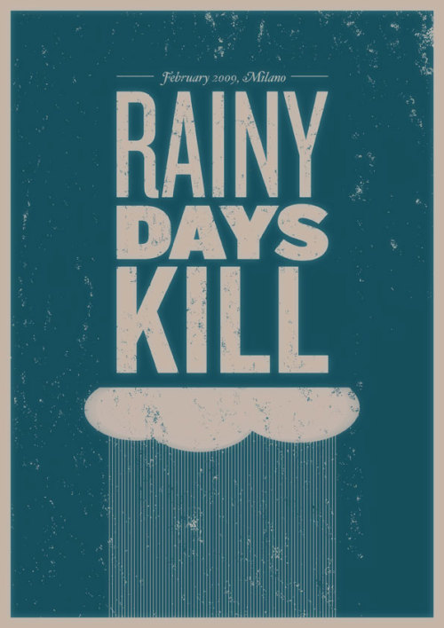
I actually love rainy days, as well as the simple, clean design and muted colors of this poster.
Speaking of weather, It's been foggy and cold the past couple of days here, so I'm in a bit of a quiet, introspective mood. Today is one of two looong days at school (8am to 5:30pm -- just like a workday, except I'm paying to be there), so I'll leave it at that. Have a great Tuesday!
published at
04:57
2
comment(s)
15 January 2010
Speak Out.
In my endless wanderings around the Web, I happened upon "The Pencil Is Mightier Than The Sword," a (now-closed) international contest for graphic designers held by poster4tomorrow, a coalition of French and Italian art and design firms. The theme was "freedom of expression," from the call for entries:
I love love love stuff like this. Great design for an even greater cause = win/win.
When people talk, governments have to listen. Except that in some countries people aren’t allowed to talk. So we’ve got to talk for them. In the United States of America we’ve seen recently what the power of collective action can achieve. Now we must harness the same power to speak for those people who can’t call for change in their own countries.In all, over 1800 entries were received by a multi-national panel, and the winning 100 posters are currently touring and exhibiting in galleries and museums worldwide. While all are striking and make their point quite clear, here are three of my favorites:
- "Instinct" by Sadra Wejdani, Tehran, Iran
- "Weapon Of Choice" by Gram Garner, Austin TX, United States
- "If You Have Any Objections, Speak Out" by Junxiao Xu, Hangzhou, China
I love love love stuff like this. Great design for an even greater cause = win/win.
published at
06:09
0
comment(s)
05 November 2009
05 October 2009
Taste The Rainbow.
That's not just the slogan for Skittles, or a punchline from a Dane Cook bit, but an appropriate description of what designer Rebecca Gimenez did with a notice board. She was probably just walking along when she saw this:
Apparently, notice boards are just as subject to spontaneous design as anything else. I mean, why not? Almost everyone else would've walked by without a second thought, but she left the board looking like this:
Muuuch better. I dig these exercises in creating visually pleasing order from chaos. Now, I'm not generally a proponent of going up to some random notice board outside of your public library and having your way with assorted lost dog posters, club flyers and lawnmowing solicitations in the name of Design. You can actually DIY at home with the bookshelves in your living room, provided you own enough books to do so [via Freshome].
There's even a Flickr pool now with some more great examples. You probably wouldn't like it if you prefer organizing your collection by subject or author, but the results can be undeniably gorgeous.
Sadly, I don't own this many books, and currently only have a handful from my collection on display in my apartment (the rest are boxed up in storage), so this wouldn't work out quite so nicely for me. Now think of how much work it would take to rearrange twenty thousand books this way, like artist Chris Cobb's "installation" at San Francisco's Adobe Bookshop in 2004, called "There Is Nothing Wrong In This Whole Wide World". Twenty thousand books. That, My Peoples, is dedication to the art.
Apparently, notice boards are just as subject to spontaneous design as anything else. I mean, why not? Almost everyone else would've walked by without a second thought, but she left the board looking like this:
Muuuch better. I dig these exercises in creating visually pleasing order from chaos. Now, I'm not generally a proponent of going up to some random notice board outside of your public library and having your way with assorted lost dog posters, club flyers and lawnmowing solicitations in the name of Design. You can actually DIY at home with the bookshelves in your living room, provided you own enough books to do so [via Freshome].
There's even a Flickr pool now with some more great examples. You probably wouldn't like it if you prefer organizing your collection by subject or author, but the results can be undeniably gorgeous.
Sadly, I don't own this many books, and currently only have a handful from my collection on display in my apartment (the rest are boxed up in storage), so this wouldn't work out quite so nicely for me. Now think of how much work it would take to rearrange twenty thousand books this way, like artist Chris Cobb's "installation" at San Francisco's Adobe Bookshop in 2004, called "There Is Nothing Wrong In This Whole Wide World". Twenty thousand books. That, My Peoples, is dedication to the art.
published at
04:04
0
comment(s)
filed under
art,
chris cobb,
color,
dane cook,
design,
rebecca gimenez
15 September 2009
Minimalist Typographic & Packaging Style.
I have a funky habit of removing labels from stuff. No, not clothing labels -- but bottles, jars and miscellaneous containers. I like the packages in my house to be "clean" and uncluttered with unnecessary text and noise (if I can help it). Most often it's the objects in my bathroom and kitchen that are stripped down to the essence -- including bottles for shampoo, conditioner and body wash, soap/lotion dispenser pumps, and even miscellaneous hair/skin products. One of my friends called it "Zen" which I thought was appropriate and cool, but most people end up confused for a few seconds until I point out which container holds what stuff.
What can I say? Blame it on my inner minimalist.
So you can pretty much imagine that this Bittbox article on package design held my attention for more than a few minutes. Some sample images:
These are gorgeous.
There's a debate going on in the comments section of the BittBox article: Some commenters argue that a few of the packages looked "generic" owing to the simplicity of their designs, but I contend that one needs to look at the subtle typographical details (as well as the design of the package itself) in order to appreciate the difference.
One can split effective design into two halves, good and great. Good package design conveys just enough information to relay the contents of the wrapper; great package design adds humor or cleverness to the mix and elevates the entire idea. They're probably not appropriate for every dining occasion, but you can't tell me the salt & pepper batteries aren't awesome.
What can I say? Blame it on my inner minimalist.
So you can pretty much imagine that this Bittbox article on package design held my attention for more than a few minutes. Some sample images:
These are gorgeous.
There's a debate going on in the comments section of the BittBox article: Some commenters argue that a few of the packages looked "generic" owing to the simplicity of their designs, but I contend that one needs to look at the subtle typographical details (as well as the design of the package itself) in order to appreciate the difference.
One can split effective design into two halves, good and great. Good package design conveys just enough information to relay the contents of the wrapper; great package design adds humor or cleverness to the mix and elevates the entire idea. They're probably not appropriate for every dining occasion, but you can't tell me the salt & pepper batteries aren't awesome.
published at
06:16
0
comment(s)
filed under
bittbox,
cool,
design,
minimalism
05 September 2009
On Character And Soul In Design, Part 02.
Read Part 01.
Although the shabby-chic movement has gained some popularity as vintage has made the mainstream, people are incorporating cleaner, more modern design elements into their homes. Personally I'm all for updating the look of your living room, etc. as I'm a huge fan of contemporary furniture. All the hosts on HGTV speak gospel: Even just one or two well-placed pieces can transform a space.
A big problem I've seen with this, however, is overdoing the look. Yes, it's good to have the majority of your pieces match and decluttering is never a bad idea, but this post on Apartment Therapy and the resulting comments gave me some food for thought. AT showcased rooms from the homes of two leading fashion icons, Tom Ford (Gucci) and Karl Lagerfield (Chanel). Interestingly, as many people disliked the layouts and design choices by either/both as there were supporters of their respective styles. What do you think?


There were several comments on how each space seemed "superficial", "all show, no depth", "cold", "staged", "wanky" (haha) and "soulless". I lingered on that last adjective a bit longer.
Soulless.
That's a scary word ... even scarier when you apply it to how your living room looks *shudder*. I would assume that one cardinal rule of decorating and design is to individualize the space -- give it some of your personality. Yes, DWR showrooms can look pretty damn awesome, but those are meant to appeal to the broadest possible population of savvy furniture-shoppers. And frankly, they lack any kind of individual appeal. They look "staged", unlived-in (is that a word?), and muted, much like the homes of the two designers above. Soulless.
So how do you strike a balance between impersonal sterility and gaudy tackiness -- and still be able to win design contests on Apartment Therapy?
The answer, my modern-minded friend, is restraint. Part Three is coming soon.
The first tip to get you started: A plant or two might help liven up the place a little. Seriously though, bamboo shoots from IKEA are $2 each and are pretty much impossible to kill. Trust me -- I've tried.
Although the shabby-chic movement has gained some popularity as vintage has made the mainstream, people are incorporating cleaner, more modern design elements into their homes. Personally I'm all for updating the look of your living room, etc. as I'm a huge fan of contemporary furniture. All the hosts on HGTV speak gospel: Even just one or two well-placed pieces can transform a space.
A big problem I've seen with this, however, is overdoing the look. Yes, it's good to have the majority of your pieces match and decluttering is never a bad idea, but this post on Apartment Therapy and the resulting comments gave me some food for thought. AT showcased rooms from the homes of two leading fashion icons, Tom Ford (Gucci) and Karl Lagerfield (Chanel). Interestingly, as many people disliked the layouts and design choices by either/both as there were supporters of their respective styles. What do you think?
There were several comments on how each space seemed "superficial", "all show, no depth", "cold", "staged", "wanky" (haha) and "soulless". I lingered on that last adjective a bit longer.
Soulless.
That's a scary word ... even scarier when you apply it to how your living room looks *shudder*. I would assume that one cardinal rule of decorating and design is to individualize the space -- give it some of your personality. Yes, DWR showrooms can look pretty damn awesome, but those are meant to appeal to the broadest possible population of savvy furniture-shoppers. And frankly, they lack any kind of individual appeal. They look "staged", unlived-in (is that a word?), and muted, much like the homes of the two designers above. Soulless.
So how do you strike a balance between impersonal sterility and gaudy tackiness -- and still be able to win design contests on Apartment Therapy?
The answer, my modern-minded friend, is restraint. Part Three is coming soon.
The first tip to get you started: A plant or two might help liven up the place a little. Seriously though, bamboo shoots from IKEA are $2 each and are pretty much impossible to kill. Trust me -- I've tried.
28 August 2009
The Black Apartment.
Being a avid reader of several modern design and lifestyle websites/blogs, I'd happen across the occasional article on painting your doors, walls or entire room black. While still quite unconventional, the results are always very striking and attractive -- the absence of color, if used correctly and tastefully, accentuate the remaining hues in the room.
I mean c'mon, I never really thought about painting a bathroom black (the closest I've ever gotten is a deep purple). But admit it, it looks damn good.
Sophisticated and dramatic, the trend is gaining fast in popularity although you probably won't see too many of these in the pages of Better Homes & Gardens quite yet. This is a far cry from the typical depressing/macabre/creepy/Goth sensibility that usually comes to mind when you think about painting in this color. But it's still a pretty bold choice to go with, and most people still shy away from it.
Well then, what would you say to an entire apartment painted a glossy black? Dwell.com frequently profiles innovative and creative living spaces, and this Chelsea apartment, formerly the "front half of the sixth floor of a YMCA" building and owned by consultant Cindy Gallop, is just about the best example I've seen so far.
I could do without the stuffed armadillo and the Gucci chainsaw, and yeah Gallop defines it as a "bachelorette pad," but yooooooooo this is sick. Everything -- from the eclectic art pieces, bookshelf items, all the way down to the couch cushions -- just pop. It's extremely visually appealing, daring and classy. Plus hip-hop even acknowledged it for a quick second; Biggie's "Nasty Girl" video was filmed here (although obviously it wasn't the focal point of the video, and I'd want to thoroughly bleach the hell out of the tub after Nelly's ass marinated in it for God knows how long). But man -- if I ever find the right spot, I'd absolutely consider doing this. The whole crib is primo eye candy and it isn't even using a traditional color. Just about as unconventional as a paint job gets.
"Give up white, and turn to the dark side. It's a lot more fun." - Cindy Gallop
I think she may be onto something.
I mean c'mon, I never really thought about painting a bathroom black (the closest I've ever gotten is a deep purple). But admit it, it looks damn good.
Sophisticated and dramatic, the trend is gaining fast in popularity although you probably won't see too many of these in the pages of Better Homes & Gardens quite yet. This is a far cry from the typical depressing/macabre/creepy/Goth sensibility that usually comes to mind when you think about painting in this color. But it's still a pretty bold choice to go with, and most people still shy away from it.
Well then, what would you say to an entire apartment painted a glossy black? Dwell.com frequently profiles innovative and creative living spaces, and this Chelsea apartment, formerly the "front half of the sixth floor of a YMCA" building and owned by consultant Cindy Gallop, is just about the best example I've seen so far.
I could do without the stuffed armadillo and the Gucci chainsaw, and yeah Gallop defines it as a "bachelorette pad," but yooooooooo this is sick. Everything -- from the eclectic art pieces, bookshelf items, all the way down to the couch cushions -- just pop. It's extremely visually appealing, daring and classy. Plus hip-hop even acknowledged it for a quick second; Biggie's "Nasty Girl" video was filmed here (although obviously it wasn't the focal point of the video, and I'd want to thoroughly bleach the hell out of the tub after Nelly's ass marinated in it for God knows how long). But man -- if I ever find the right spot, I'd absolutely consider doing this. The whole crib is primo eye candy and it isn't even using a traditional color. Just about as unconventional as a paint job gets.
"Give up white, and turn to the dark side. It's a lot more fun." - Cindy Gallop
I think she may be onto something.
published at
08:22
0
comment(s)
filed under
apartment living,
color,
cool,
design,
notorious big,
rap,
video
24 August 2009
On Character And Soul In Design, Part 01.
Currently marinating in Sally Shapiro's latest summery effort My Guilty Pleasure -- which perfectly complements this lazy, breezy afternoon. The weather should be perfect later for early evening jogging.
So last week I was hanging out after dinner with my sister Genevieve and her husband Mick. They're considering buying a house sometime in the next few months and she'd cued up a website which allowed them some sneak peeks at properties up for sale, complete with photos of the exteriors and interiors of the homes. Listening to their conversations over the dining room table, it was obvious that they each had different style sensibilities:
G: [clicking on a house] Oh look at this one. It looks cute!
M: It looks old.
G: What are you talking about. It has character. I hate how modern houses all look the same.
M: Yeah but they won't fall apart on you. When was that built?
G: Umm, it says 1952.
M: That's too old.
G: But I love how it looks. We can always fix it up.
M: What, you wanna buy a house just so you can spend all your time fixing it? And what is that [pointing to an interior photo of a completely round doorway] -- a hobbit door?
G: It's cute!
M: I'm not gonna live in the Shire. Let's see something with clean lines and built sometime after your grandma was born.
G: What! Don't bring my family into this! [kicks Mick's chair over]
M: [jumping up] I'm not a hobbit and I will not live in a house older than the hills!! Grragghhh!! [grabs laptop and hurls it into wall]
Lights suddenly flicker on and off. Room temperature inexplicably drops 20 degrees.
G: [hissing and baring three-inch fangs] I WILL DEVOUR YOUR EYES.
Okay so I made that last part up. She really said, "I WILL DEVOUR YOUR HEART." Married life is a funny thing.
But I digress. While I side with Mick in that a house shouldn't be a money pit, I can see her point about a home -- or any major thing you own, really -- having some kind of character/soul. My sister has developed a unique sense of style over the years. It appears to be a very eclectic combination of pseudo-shabby chic and mid-20th-century aesthetics with a dash of Ikea thrown in for good measure, and it shows in the types of furniture and design features she seems to prefer. Nothing too ultra-modern or sleek, her choices radiate a kind of warmth, sturdiness, brightness and a bit of good loving wear. I don't see her living happily in a pre-fabricated box, constructed over angles and lines. (That, actually, would be me.)
I've been an apartment/condo-dweller for most of my adult life, so my design choices have been somewhat restricted to what I can do with the smaller spaces provided me. I've slowly collected a few furniture pieces that I love which reflect my design aesthetic (contemporary, minimalist, clean and square/symmetric yet comfortable). These are the larger pieces -- sofa, bed -- which are accented by occasional "softer" items. I'm not at a point yet where I can completely deck out my place with things that satisfy me design-wise, but I've got a good sense of the look in mind and am near-constantly looking for ideas, many of which come from:


A wide variety of design influences, to be sure, but hopefully unique enough on their own that, when combined, please the eye. I guess we'll find out when I get around to buying a house in the Shire.
So last week I was hanging out after dinner with my sister Genevieve and her husband Mick. They're considering buying a house sometime in the next few months and she'd cued up a website which allowed them some sneak peeks at properties up for sale, complete with photos of the exteriors and interiors of the homes. Listening to their conversations over the dining room table, it was obvious that they each had different style sensibilities:
G: [clicking on a house] Oh look at this one. It looks cute!
M: It looks old.
G: What are you talking about. It has character. I hate how modern houses all look the same.
M: Yeah but they won't fall apart on you. When was that built?
G: Umm, it says 1952.
M: That's too old.
G: But I love how it looks. We can always fix it up.
M: What, you wanna buy a house just so you can spend all your time fixing it? And what is that [pointing to an interior photo of a completely round doorway] -- a hobbit door?
G: It's cute!
M: I'm not gonna live in the Shire. Let's see something with clean lines and built sometime after your grandma was born.
G: What! Don't bring my family into this! [kicks Mick's chair over]
M: [jumping up] I'm not a hobbit and I will not live in a house older than the hills!! Grragghhh!! [grabs laptop and hurls it into wall]
Lights suddenly flicker on and off. Room temperature inexplicably drops 20 degrees.
G: [hissing and baring three-inch fangs] I WILL DEVOUR YOUR EYES.
Okay so I made that last part up. She really said, "I WILL DEVOUR YOUR HEART." Married life is a funny thing.
But I digress. While I side with Mick in that a house shouldn't be a money pit, I can see her point about a home -- or any major thing you own, really -- having some kind of character/soul. My sister has developed a unique sense of style over the years. It appears to be a very eclectic combination of pseudo-shabby chic and mid-20th-century aesthetics with a dash of Ikea thrown in for good measure, and it shows in the types of furniture and design features she seems to prefer. Nothing too ultra-modern or sleek, her choices radiate a kind of warmth, sturdiness, brightness and a bit of good loving wear. I don't see her living happily in a pre-fabricated box, constructed over angles and lines. (That, actually, would be me.)
I've been an apartment/condo-dweller for most of my adult life, so my design choices have been somewhat restricted to what I can do with the smaller spaces provided me. I've slowly collected a few furniture pieces that I love which reflect my design aesthetic (contemporary, minimalist, clean and square/symmetric yet comfortable). These are the larger pieces -- sofa, bed -- which are accented by occasional "softer" items. I'm not at a point yet where I can completely deck out my place with things that satisfy me design-wise, but I've got a good sense of the look in mind and am near-constantly looking for ideas, many of which come from:
- 1960s-inspired artwork
- calligraphy/typography
- film noir
- orchids
- monochromatics
- pixel art
- low ambient lighting
- Zen
- negative space & contrast


A wide variety of design influences, to be sure, but hopefully unique enough on their own that, when combined, please the eye. I guess we'll find out when I get around to buying a house in the Shire.
published at
15:35
0
comment(s)
filed under
design
07 April 2009
Human Emotion On A Global Scale.
Clicking around the Web as usual, and found We Feel Fine, a creative and ambitious site that searches blogs for instances of the phrases "I feel" and "I am feeling." Then,When it finds such a phrase, it records the full sentence, up to the period, and identifies the "feeling" expressed in that sentence (e.g. sad, happy, depressed, etc.). Because blogs are structured in largely standard ways, the age, gender, and geographical location of the author can often be extracted and saved along with the sentence, as can the local weather conditions at the time the sentence was written. All of this information is saved.Read about the methodology and check out the current database of recorded feelings.
The result is a database of several million human feelings, increasing by 15,000 - 20,000 new feelings per day. Using a series of playful interfaces, the feelings can be searched and sorted across a number of demographic slices.
Cool as hell. The abovementioned interface is soft, colorful and aesthetically pleasant without being too busy, and it's addicting (I ended up playing with the options for awhile, and admired the design for awhile longer). I found it really interesting to visualize "feelings" this way, especially when taken out of the context of an entry in a personal blog and thrown into the mix with thousands of other random people -- and then sorted, categorized and processed into quantifiable results.
I wonder if I'm in there somewhere. Are you?
published at
11:29
0
comment(s)